

In case you couldn't tell, I'm a bit of a data geek, which means I see the world in terms of zeroes and ones (and twos and one hundred and forty eight thousands) rather than heuristic intuition.
It also means I'm uniquely suited to interpreting the volumes of data that we publish on FreeERISA, and one of the most interesting lenses to look through is geography. I know, I know, e pluribus unum and all that, but the reality is that states are different:
Recommended For You
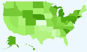
This is a map I put together of retirees. For plans in the 100+ market, I looked at how many participants each plan are retired and receiving benefits as a percentage of the total plan participation. What I found was a striking variation: 20% of plan participants in Connecticut are retired, versus only 8% in Kansas. The top states were:
Connecticut – 20%
Delaware – 20%
Maryland – 18%
Rhode Island – 17%
Michigan – 17%
And at the lower end:
New Hampshire – 10%
Oklahoma – 10%
Arkansas – 10%
Mississippi – 9%
Kansas – 8%
So we can see that the bulk are in the northeast, with a bizarre island centered around Nebraska (which happens to sit right above flat-as-a-pancake 8% Kansas).
I wish I could draw some conclusion from this data, but like I said: I just see the data. I don't interpret it.
© 2025 ALM Global, LLC, All Rights Reserved. Request academic re-use from www.copyright.com. All other uses, submit a request to [email protected]. For more information visit Asset & Logo Licensing.


