 (Credit: CDC)
Early government numbers show that at least 3.2 million people died in the United States in 2020, and that the number of deaths was at least 12% higher than expected.
The National Center for Health Centers — an arm of the U.S. Centers for Disease Control and Prevention (CDC) — has published those figures in a new batch of preliminary COVID-19 death count data. The batch covers death counts for the period extending from the week ending Jan. 4, 2020, to the week ending Jan. 2, 2021.
Recommended For You
At least 315,936, or 9.8%, of all of the deaths in the data involved COVID-19.
The preliminary numbers also include about 28,000 excess deaths not classified as involving COVID-19.
Some of those deaths could have been the result of COVID-19 cases that were not diagnosed.
Other deaths could have been the result of the effects of the COVID-19 pandemic on patients' access to high-quality health care. In the April, for example, some hospitals canceled or postponed elective procedures, in an effort to save capacity for patients with COVID-19 and to minimize the risk of patients infecting hospital workers, or of hospital workers infecting patients.
Some states take a month or more to send complete death count data to the CDC. The CDC appears to be missing about half of the death count data it will eventually receive for the period from Dec. 6 through Jan. 2. If the actual number deaths during that period was at least as a high as the number during the comparable period a year earlier, then 2020 death total could increase to about 3.3 million.
The context
In January 2020, before public health officials knew what the effects of COVID-19 on the United States would be, executives at Reinsurance Group of America Inc. talked about the assumptions they use in models for "200-year event" pandemics.
RGA executives say they have been defining a 200-year pandemic as one that increases mortality by about 1.5 deaths per 1,000 lives.
In a normal year, the United States experiences about 8.7 deaths per 1,000 lives. That means RGA's 200-year event pandemic would increase mortality about 17% over the expected level of mortality.
State data
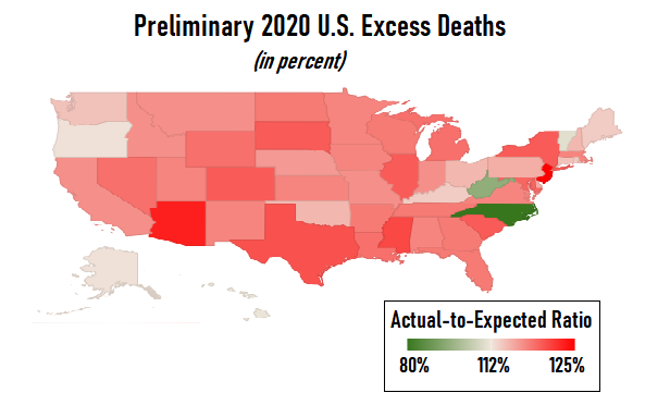
At the state level, in the preliminary data, ratios of actual deaths to expected deaths varied widely. In North Carolina, the actual number of deaths amounted to 80% of the expected number. In New Jersey, the state with the worst preliminary mortality figures, the actual number of deaths amounted to 125% of the expected number.
The National Center for Health Statistics breaks out figures for New York City separately from the figures for New York state. In New York.
National Center for Health Statistics reports are in the public domain. That means insurers, actuaries, insurance agents and other financial professionals can use the data in their own reports and publications without worrying about copyright restrictions.
Government analysts calculate the "expected number of deaths" by taking the average of the number of deaths that occurred in a given week or month during the previous three years. For January 2020, for example, the expected number of deaths was equal to the average of the death counts for January 2017, January 2018 and January 2019.
For preliminary state-level actual-to-expected death count ratios, see the table below.
.
Preliminary 2020 U.S. Deaths | |
| Actual Deaths as a Percent of Expected Deaths | |
|---|---|
| Alabama | 112 |
| Alaska | 103 |
| Arizona | 122 |
| Arkansas | 113 |
| California | 111 |
| Colorado | 116 |
| Connecticut | 106 |
| Delaware | 108 |
| District of Columbia | 114 |
| Florida | 113 |
| Georgia | 113 |
| Hawaii | 102 |
| Idaho | 111 |
| Illinois | 116 |
| Indiana | 111 |
| Iowa | 112 |
| Kansas | 112 |
| Kentucky | 105 |
| Louisiana | 114 |
| Maine | 105 |
| Maryland | 115 |
| Massachusetts | 112 |
| Michigan | 114 |
| Minnesota | 112 |
| Mississippi | 118 |
| Missouri | 111 |
| Montana | 111 |
| Nebraska | 110 |
| Nevada | 114 |
| New Hampshire | 107 |
| New Jersey | 125 |
| New Mexico | 112 |
| New York 7 | 116 |
| New York City | 149 |
| North Carolina | 80 |
| North Dakota | 113 |
| Ohio | 107 |
| Oklahoma | 107 |
| Oregon | 103 |
| Pennsylvania | 108 |
| Rhode Island | 105 |
| South Carolina | 116 |
| South Dakota | 116 |
| Tennessee | 113 |
| Texas | 117 |
| Utah | 112 |
| Vermont | 101 |
| Virginia | 112 |
| Washington | 106 |
| West Virginia | 91 |
| Wisconsin | 113 |
| Wyoming | 114 |
| Puerto Rico | 91 |
| United States | 112 |
© 2025 ALM Global, LLC, All Rights Reserved. Request academic re-use from www.copyright.com. All other uses, submit a request to [email protected]. For more information visit Asset & Logo Licensing.


